grid-template-areas

The grid-template-areas property defines a CSS grid by assigning a grid-area name to each element in the template. The grid-template property can be used as a shorthand to define the areas as well as defining the sizes of the columns and rows.
This property is collectively used with grid-template-columns and grid-template-rows under the grid-template shorthand property.
Syntax
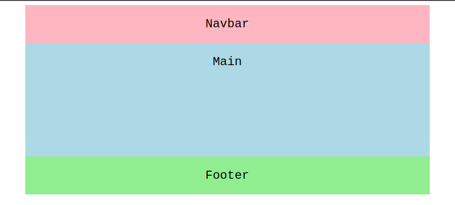
.item-one {grid-area: nav;}.item-two {grid-area: main;}.item-three {grid-area: footer;}.grid-container {display: grid;grid-template-areas:'nav nav nav''main main main''footer footer footer';}
Each grid item can be assigned a name with the grid-area property. Then, the grid-template-areas utilizes these areas in the grid container. For these properties to work, display: grid must be set in the .grid-container.
Example 1
By using grid-template-areas, it is not required to specify anything on the individual grid items except for assigning the name of the corresponding area. Everything else happens on the grid container.
.item-one {grid-area: nav;background-color: lightpink;}.item-two {grid-area: main;background-color: lightblue;}.item-three {grid-area: footer;background-color: lightgreen;}.item-four {grid-area: sidebar;background-color: lightsalmon;}.grid-container {display: grid;max-width: 800px;margin: 0 auto;grid-template-columns: repeat(3, 1fr);grid-template-rows: repeat(4, 1fr 3fr 1fr 1fr);grid-template-areas:'nav nav nav''main main sidebar''main main sidebar''footer footer footer';}
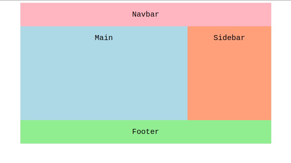
In the example above, each of the areas spans multiple grid cells and this can be achieved by repeating the name of that grid area multiple times with white space between them. Multiple white spaces can be used without causing any error. This might come in handy to place the names above each other to make it more readable. Each section in quotes represents a row and each word represents a column. At this point in time, the area created must be rectangular, because there is no way to create another shaped area.
Example 2
.item-one {grid-area: nav;background-color: lightpink;}.item-two {grid-area: main;background-color: lightblue;}.item-three {grid-area: footer;background-color: lightgreen;}.item-four {grid-area: sidebar;background-color: lightsalmon;}.grid-container {display: grid;max-width: 800px;margin: 0 auto;grid-template-columns: repeat(3, 1fr);grid-template-rows: repeat(4, 1fr 3fr 1fr 1fr);grid-template-areas:'nav nav nav''main main sidebar''main main ...''footer footer footer';}
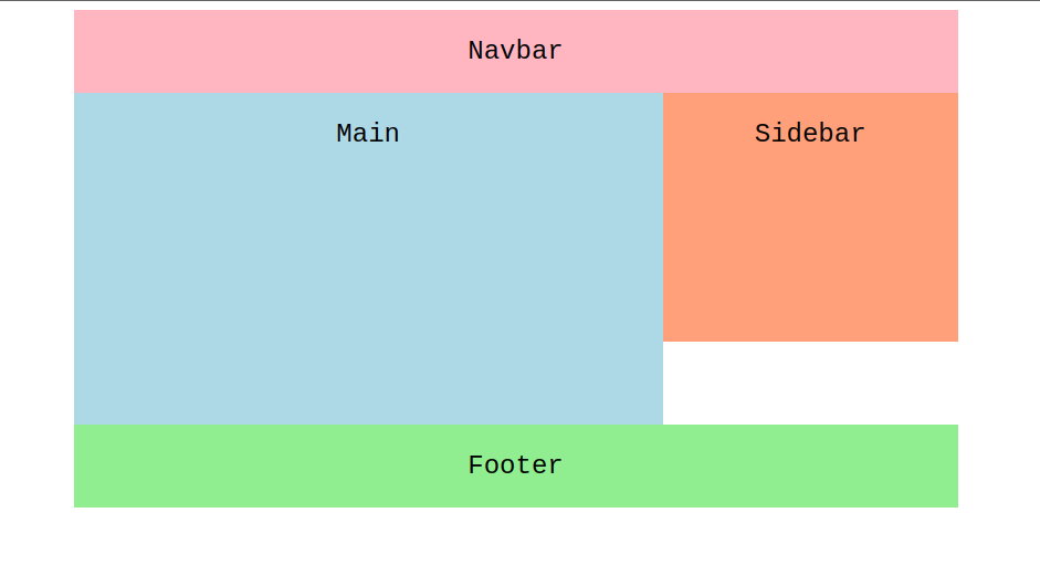
Grid cells can also be left empty with a period . instead of white spaces or names. As long as there is no white space between them, one or more period(s) can be used for the empty cell.
Looking to contribute?
- Learn more about how to get involved.
- Edit this page on GitHub to fix an error or make an improvement.
- Submit feedback to let us know how we can improve Docs.

