.pie()

nate180961208145091 total contribution
Published Apr 8, 2023
Contribute to Docs
The .pie() method in the Matplotlib library is used to draw a pie chart, a common format that shows the percentage of individual elements with respect to the data as a whole.
Syntax
matplotlib.pyplot.pie(x, explode, labels, colors, autopct, pctdistance, shadow, labeldistance, startangle, radius, counterclock, wedgeprops, textprops, center, frame, rotatelabels, normalize, hatch, data)
The x parameter, the data to be mapped, is required and represents a 1D array-like object. Other parameters are optional and modify plot features like wedge colors and labels.
.pie() takes the following arguments:
x: 1D array-like object that specifies the wedge sizes.explode: Array-like object which specifies the fraction of the radius with which to offset each wedge.labels: A list of strings to provide labels for each wedge.colors: Array-like sequence of colors that the pie chart will cycle through.autopct: A string or function used to generate labels inside the wedges showing their numeric value.pctdistance: The relative distance along the radius to draw the text generated byautopct.shadow: Boolean value indicates if a shadow is drawn beneath the pie.labeldistance: The relative distance along the radius to draw the labels.startangle: An angle, counterclockwise from the x-axis, at which to rotate the start of the pie.radius: The radius of the pie.counterclock: Boolean to specify clockwise or counterclockwise direction for fractions.wedgeprops: Dict of arguments to pass to eachpatches.Wedge.textprops: Dict of arguments passed to the text objects.center: (float, float), the center coordinates of the chart.frame: Bool, determines if Axes frame is plotted with the chart.rotatelabels: IfTrue, rotates each label to the angle of the corresponding slice.normalize: Bool, whenTrue, always make a full pie by normalizing x, otherwise results in a partial pie.hatch: Str or list, hatching pattern applied to all pie wedges or sequence of patterns that the chart will cycle through.
Examples
Examples below demonstrate the use of .pie() to plot values and show the functionality of some arguments.
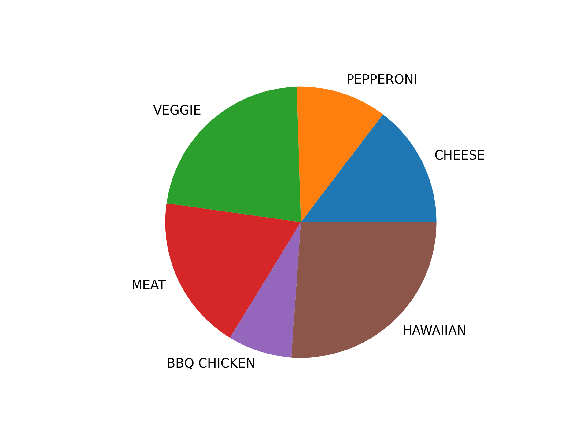
A simple pie chart:
# Import librariesfrom matplotlib import pyplot as plt# Creating datasetpizza = ['CHEESE','PEPPERONI','VEGGIE','MEAT','BBQ CHICKEN','HAWAIIAN']data = [23, 17, 35, 29, 12, 41]# Creating plotplt.pie(data, labels = pizza)# show plotplt.show()
Output:
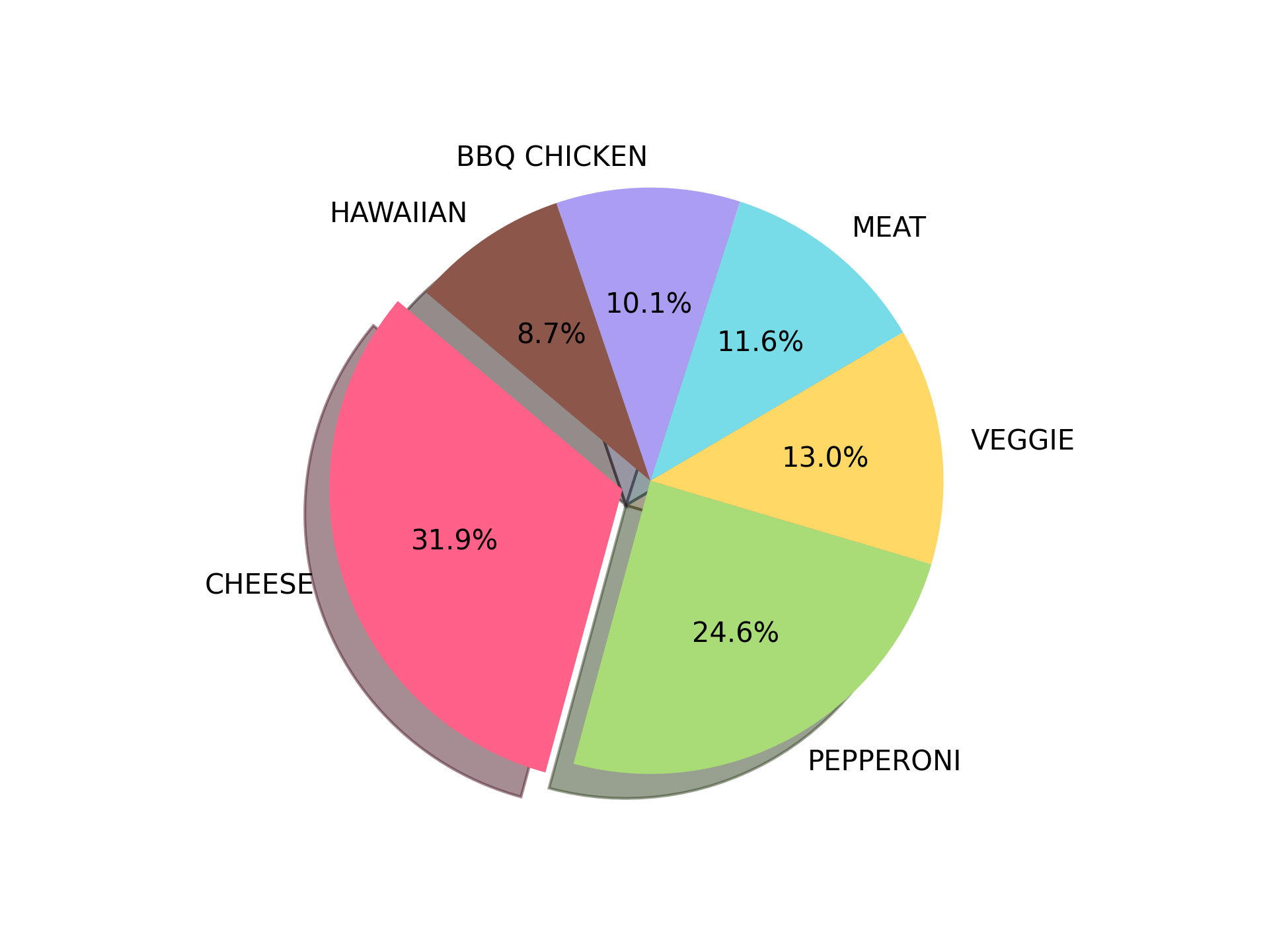
Customizing the pie chart:
# Import librariesimport matplotlib.pyplot as plt# Plot datapizza = ['CHEESE','PEPPERONI','VEGGIE','MEAT','BBQ CHICKEN','HAWAIIAN']popularity = [22, 17, 9, 8, 7, 6]#colors = ['red', 'green', 'yellow', 'blue', 'purple', 'brown']colors = ['#FF6188', '#A9DC76', '#FFD866', '#78DCE8', '#AB9DF2', '#8c564b']# explode 1st sliceexplode = (0.1, 0, 0, 0, 0, 0)# Plotplt.pie(popularity, explode=explode, labels=pizza, colors=colors, autopct='%1.1f%%', shadow=True, startangle=140)plt.show()
Output:
Looking to contribute?
- Learn more about how to get involved.
- Edit this page on GitHub to fix an error or make an improvement.
- Submit feedback to let us know how we can improve Docs.

