Colors

Color is a structure that creates color instances. Colors can be created from RGB, HSL, or grayscale component values and from standard color properties which are type properties.
Color instances (type properties) can be used as arguments, for example, to fill backgrounds and shapes or to apply color to text. They can also be used directly as views, creating a rectangle area filled with their color that adapts to fill the space available.
Colors from Component Values
Colors can be created from RGB (Red, Green, Blue), HSL (Hue, Saturation, Lightness), or grayscale component values.
RGB
RGB colors can be created by specifying the amount of red, green, and blue as a Double value (amount) between 0 and 255:
let rgbColor = Color(red: amount, green: amount, blue: amount)
HSL
HSL colors can be created by specifying the amount of hue, saturation, and lightness as Double values. hue requires a value between 0 and 360. saturation and lightness both require values between 0 and 1.
let hslColor = Color(hue: amount, saturation: amount, lightness: amount)
Grayscale
Grayscale colors can be created by specifying the amount of white as a Double value between 0 and 1:
let grayscaleColor = Color(white: amount)
All colors can also have an optional opacity argument with a Double value between 0 and 1; the default is 1.
Example
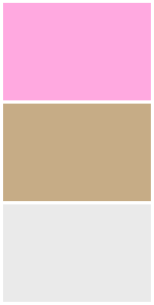
The following example creates three colors from component values and displays them in a VStack as views that fill the available area:
import SwiftUIstruct ContentView: View {var body: some View {let bubbleGumPink = Color(red: 9.9, green: 0.7, blue: 0.9)let fudgeBeige = Color(hue: 0.1, saturation: 0.3, brightness: 0.8)let moonGray = Color(white: 0.9, opacity: 0.7)VStack {bubbleGumPinkfudgeBeigemoonGray}.padding()}}
This will display:
Standard Color Properties
Colors created from standard color properties can be declared using dot notation or bracket notation:
let someColor = Color.color property
let someColor = Color(.color property and optional color component values)
Here are some of the standard color properties that are available. Many of the color properties will change depending on their context, for example, if light or dark mode is set.
.red(context-dependent).orange(context-dependent).green(context-dependent).white.black.primary(context-dependent).secondary(context-dependent)
Example
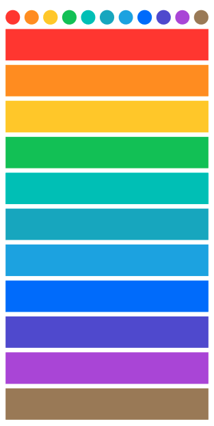
The following example displays some uses for Color. An array of colors is declared using standard color properties and used to fill a series of views:
import SwiftUIstruct ContentView: View {var body: some View {// Here, for example, .red is the shorthand for Color.redlet rainbowColors = [Color.red, Color.orange, Color.yellow, Color.green, Color.mint, Color.teal, Color.cyan, Color.blue, Color.indigo, Color.purple, Color.brown]VStack {HStack {ForEach(rainbowColors, id: \.self) { color inCircle().fill(color)}}ForEach(rainbowColors, id: \.self) { color incolor}}.padding()}}
In the example above, the first ForEach loop displays a sequence of Circles filled with each color in the rainbowColors array. The next ForEach loop returns each color in the array, creating a sequence of rectangle views filled with each color.
This will display:
Looking to contribute?
- Learn more about how to get involved.
- Edit this page on GitHub to fix an error or make an improvement.
- Submit feedback to let us know how we can improve Docs.

